Redesigning MAAS: Scalable Infrastructure UI That Inspired a Design System Shift
Context:
MAAS 2.8’s UI struggled to scale. Navigation was unintuitive, actions were buried far from context, and real-time status was hard to see. We set out to modernize MAAS and align the layout across Canonical’s Cloud & Infra products.
Challenge:
How might we create a functional, scalable application layout that:
- Improves learnability, efficiency, and error tolerance
- Scales to large environments (100–1800+ machines)
- Serves as a foundation for the division’s design system
My Role:
UX Lead partnering with Engineering & PM.
- 5 internal + 1 external user interviews
- Survey + card-sorting + usability tests
- 6 design iterations → final layout adopted into the Design System
Research
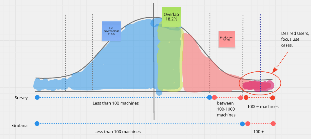
User segments (survey + Grafana mapping):
- 35.5% production private cloud
- 64.6% lab/homelab
- 18.2% use both
Observed behaviors:
- Power users open multiple tabs to offset slow loads (up to 3 min for 1800+ machines)
- ~30% are CLI-first (UI used mostly for bulk tasks)
Pain points:
- Navigation & IA: nested menus, unclear clustering (networking)
- Action placement: key actions hidden in a distant “Action” button
- Layout scaling: centered grid limited table space
- Reality gap: UI lacked real-time process visibility; users relied on CLI
Problems to Solve
1) Navigation & Information Architecture
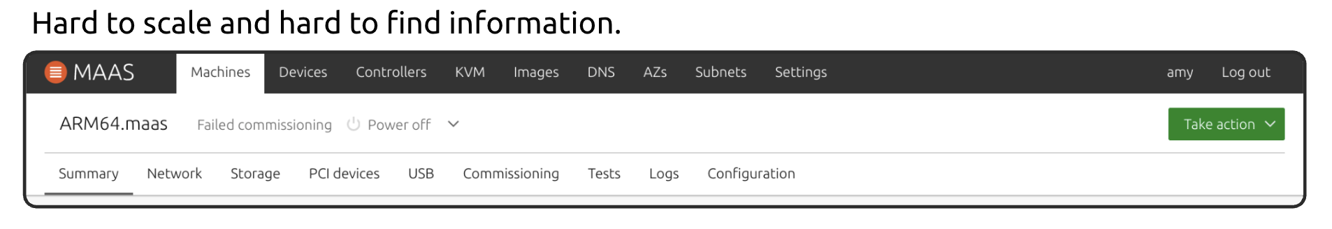
Old top bar was “clean” but didn’t scale semantically; nested submenus caused misclicks.
Card sorting insights: networking concepts (fabric, VLAN, subnets, spaces) clustered poorly and were ambiguous.
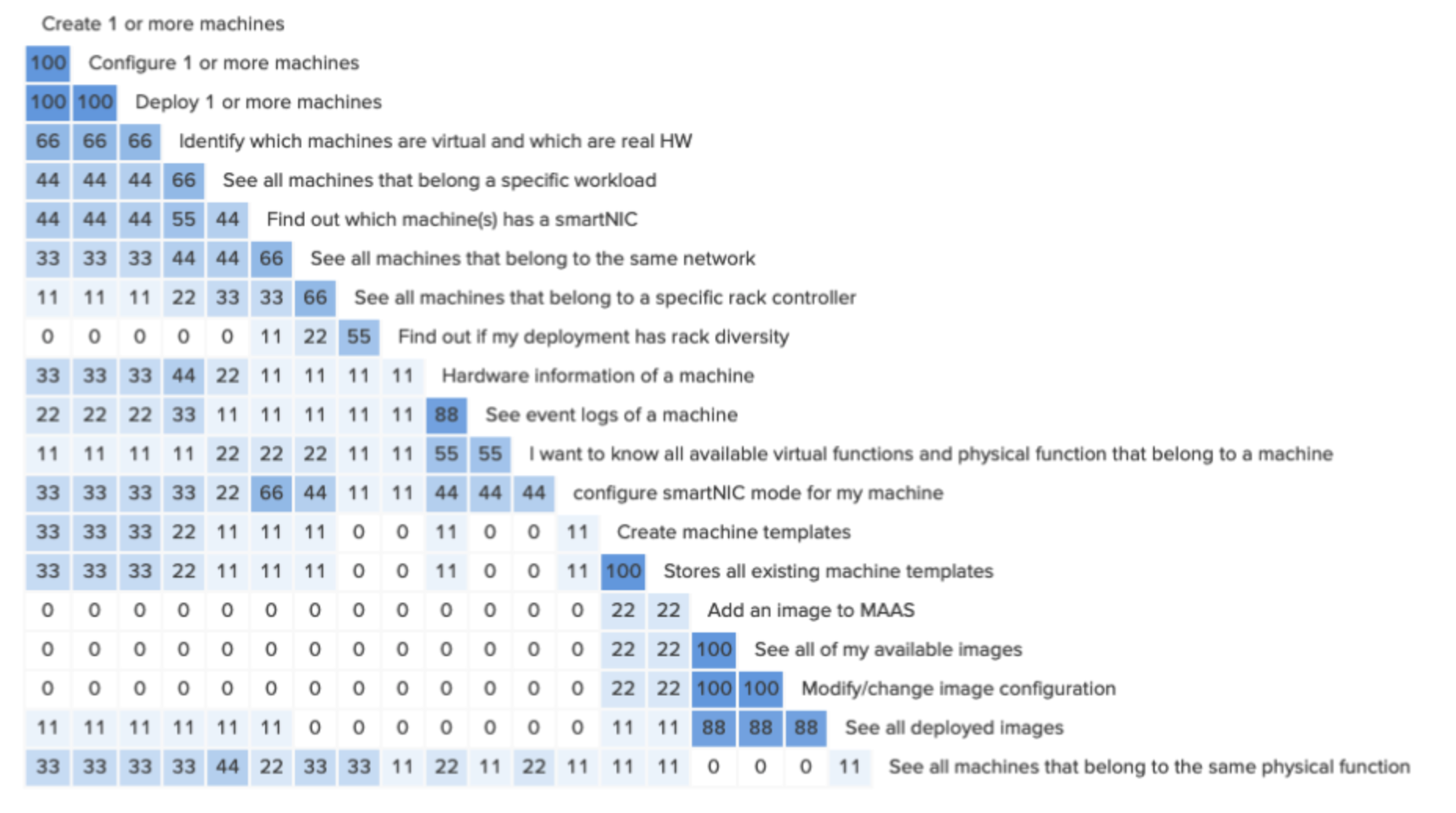
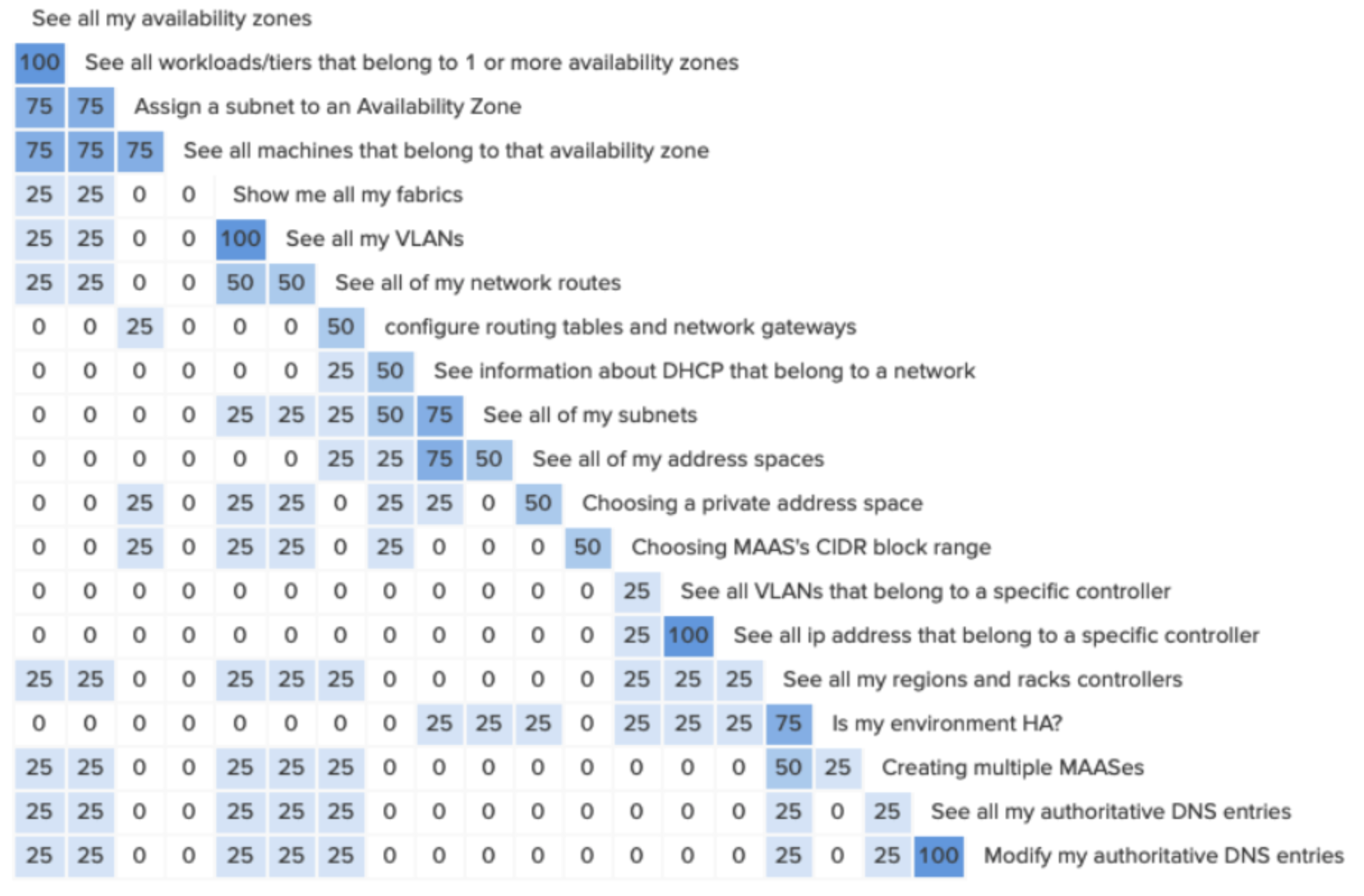
Conclusion: current IA confused even experienced operators; logs and networking were hard to find (9/10 misclicked in tests).
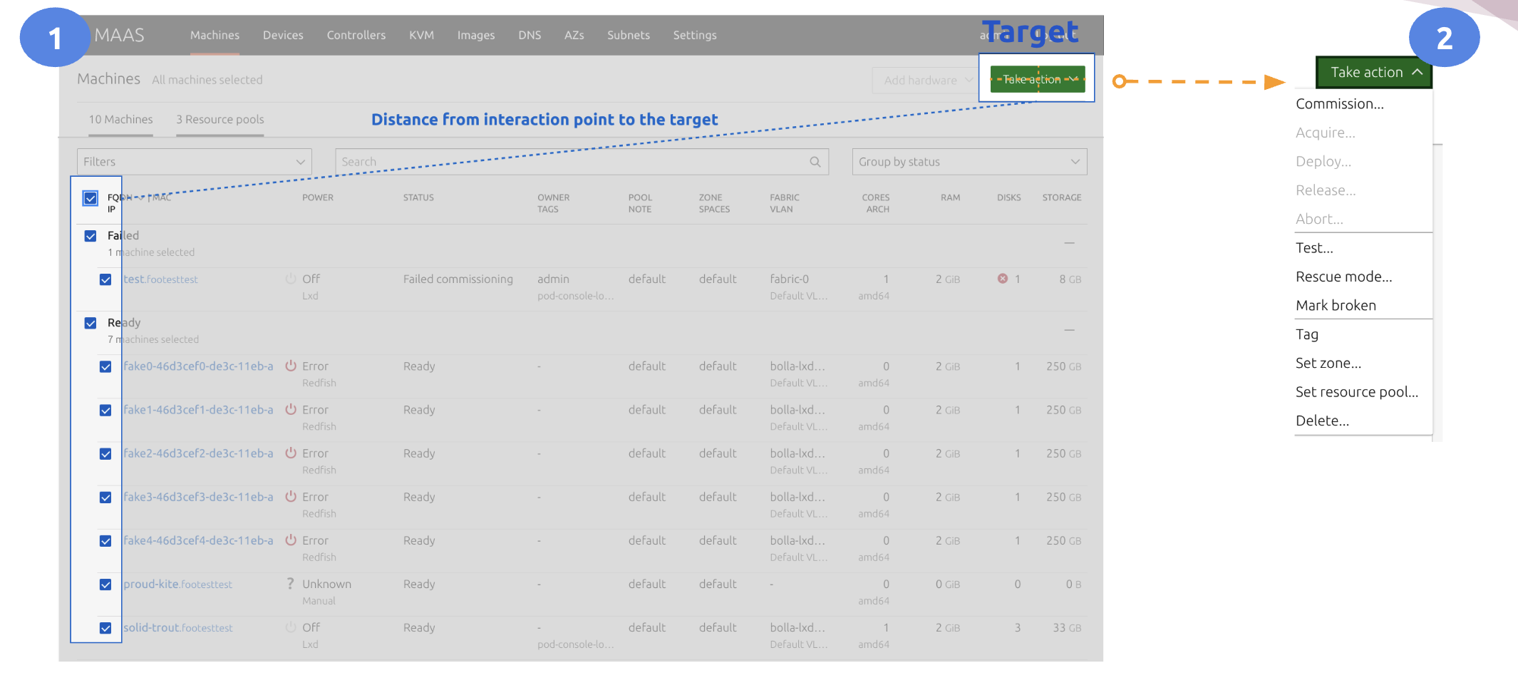
2) Action Button (Context & Efficiency)
All actions were buried in a single green button, far from machine context—inefficient and error-prone.
3) Layout & Real-Time Feedback
Centered grid constrained data density; status/errors were not surfaced where users looked.
“I only use the UI for bulk actions because I cannot do that in the CLI, but the CLI is more reliable.”
About 30% of our user based are recurring users of MAAS and started using MAAS since there were no UI. The CLI was originally design for machines to talk to machines, so most provisioning actions were done through a script via Foundations Cloud Engine (FCE) to on-board a new private cloud. A usual behavior is that users will rely on the CLI and only use the UI on redundant tasks. This creates a layer of complexity which made the entire experience very confusing, hardly learnable, and inefficient.
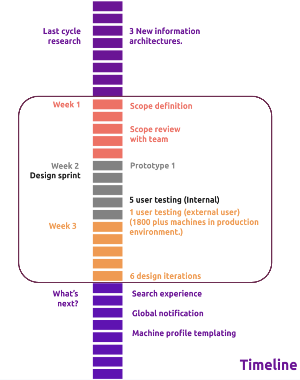
Prototyping & Testing (6 Iterations)
We explored 5 components: Side Navigation, Action Bundle, Status Bar, Quick Access List, and IA changes.
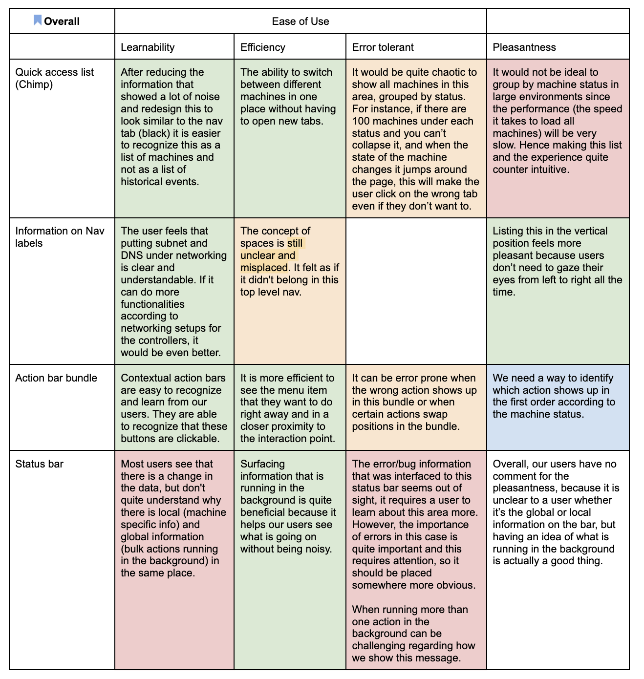
What worked ✅
- Side Navigation: reduced left-right gaze; clearer grouping
- Action Bundle: contextual actions cut click complexity (5/6 praised)
- Status Bar: surfaced commissioning/deploy operations without page switching
- Quick Access List: fast machine switching for debugging
What needed work ⚠️
- Quick Access grouping: items “jumped” mid-action; risky in large lists
- Performance constraints: 100–1800+ items made quick list less useful
- Status visibility: errors outside the F-pattern were often missed
Design Solutions
-
Restructured IA
- Nest networking concepts appropriately; remove underused globals
- Make logs and recurrent tasks first-class citizens
-
Contextual Action Bundle
- Primary action adapts to machine state (e.g., deployed ≠ commission)
- Bulk vs inline actions clarified and closer to list context
-
Status Bar Enhancements
- Global task awareness (commission/deploy/acquire) stays visible
- Proposal: notification center for critical alerts & multi-task queues
-
Quick Access Optimization
- Default to relevant states (e.g., failed) over full list for scale
- Avoid list “jumping” during background actions
Results
- Adopted into Canonical’s Design System for Cloud & Infra apps
- Reduced click complexity (action bundle rated “very convenient” by 5/6)
- Navigation errors decreased with side nav + IA fixes in testing
- Identified performance bottlenecks → informed MAAS Search performance work
Timeline
In 6 weeks, we prototyped the new application layout, tested with 6 participants, and iterated rapidly.
After the final share-out, other teams pivoted to the new layout, and these patterns were promoted to the Design System.
Results in Detail
Status Bar
Commissioning failure was detectable, but placement (bottom-right) sat outside the F-pattern—errors were easy to miss.
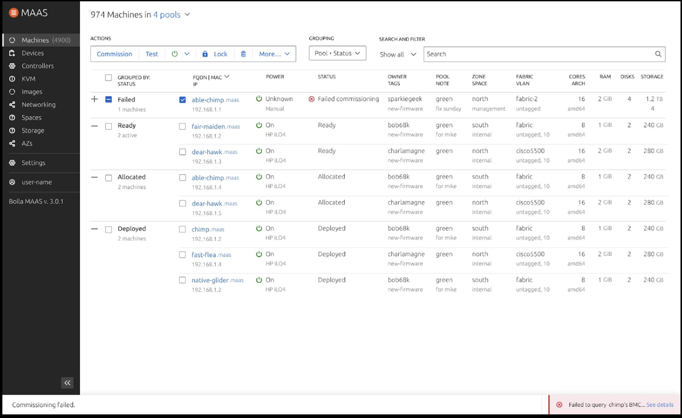
“The bottom bug feels out of sight, very easy to not see.” — David A. (external user, 1800 machines)
Follow-ups: multi-task display, attention-capturing alerts, global vs machine-local info model.
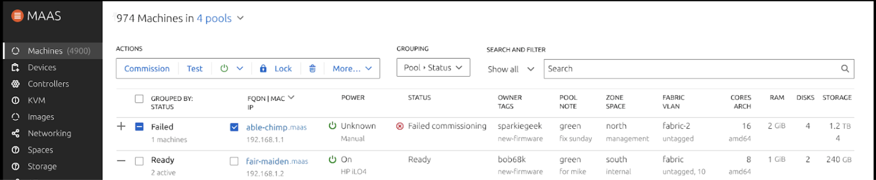
Action Bundle
Before → after improvements and bulk/inline variants:
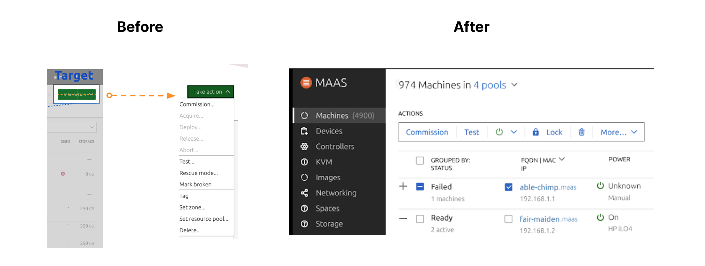
Full top bar view
Grouping proposal
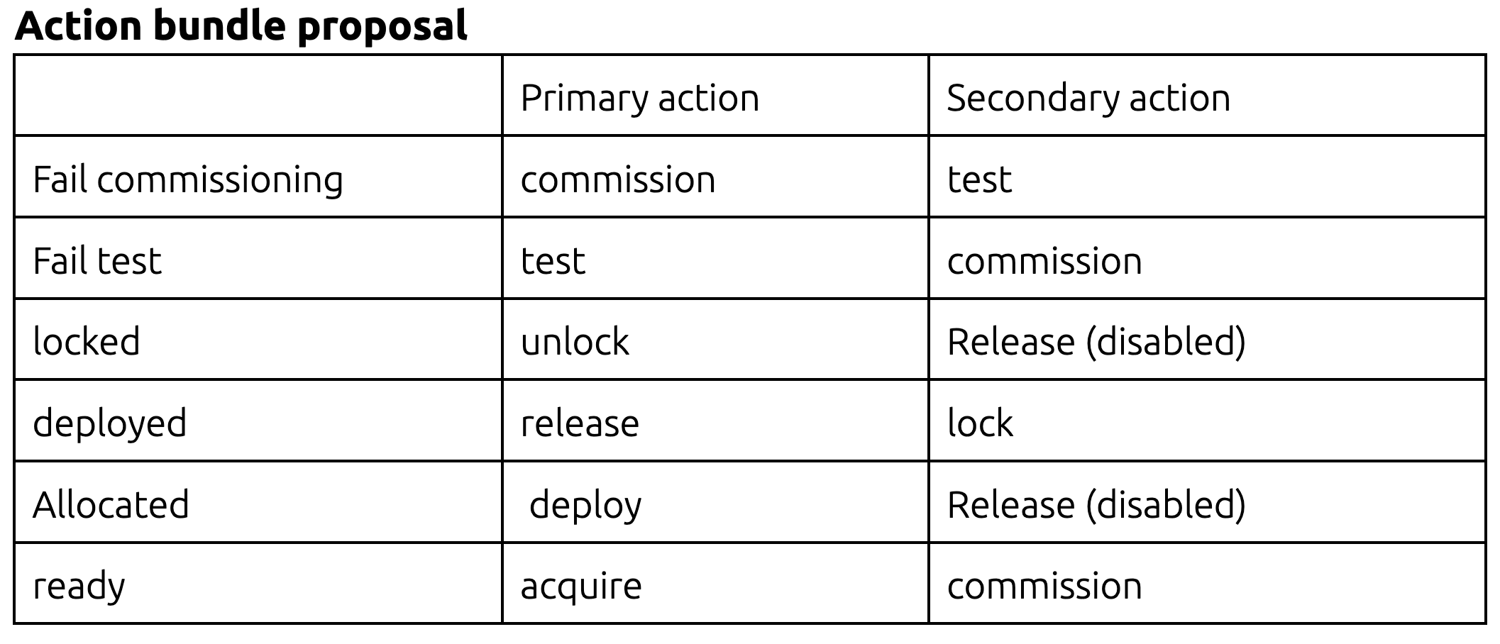
Open question we validated: How should actions display when mixed states are selected?
Quick Access List
Great for fast switching, but listing 100–1000+ machines reduces usefulness.
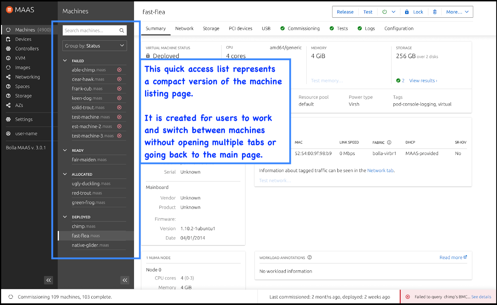
Direction: surface relevant defaults (e.g., failed) and avoid mid-action reordering.
Sneak Peek: Final Prototype
Task 1: Commissioning flow
- What did you observe?
- How did you understand what was happening?
- How clear was the error?
- Expand/collapse nav—compare both views.
Task 2: Quick Access List
- Compare fast-flea vs chimp details.
- What’s easier/harder vs previous MAAS?
Status Bar prompts
- Which info matters most to you?
- Is relative time helpful?
- How does new action placement affect your workflow?
Learnings
- Users open multiple tabs to mitigate slow list loads and compare hardware configs.
- Advanced search (regex, AND/OR) is vital; saved history reduces rework.
- Performance drives UX value—IA and lists only help if the system is fast.
Future work and next steps:
- Advance search (NLP Search)
- Notification center (global and local)
- Showing local error messages
- Machine profile templating (storage and networking)